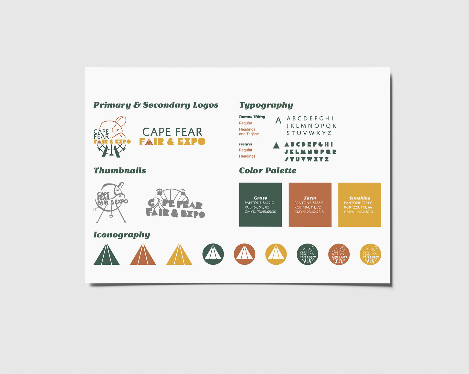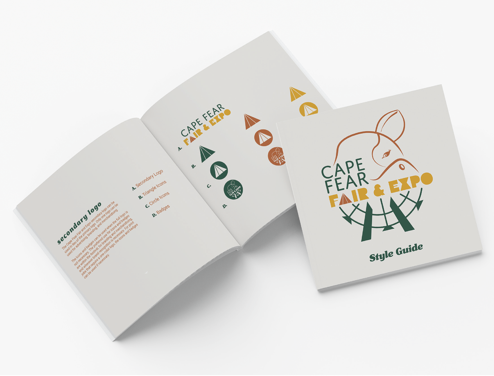
The Cape Fear Fair and Expo in North Carolina features livestock, agriculture, attractions, and food. The redesigned logo uses the Gestalt Theory of Closure for the cow. To balance the design, the bottom of the logo features a Ferris wheel. The a in fair is designed as a fair tent to symbolize the location of the event. A secondary logo was created removing the graphic elements and leaving the text. The color palette is reminiscent of nature reflecting the festival's purpose. The typography of the logo is a sans serif for "Cape Fear" contrasting the art deco font for "Fair & Expo" to provide variety of the well-designed logo. The graphic elements vary in weight and the logo features three colors to unify the design.
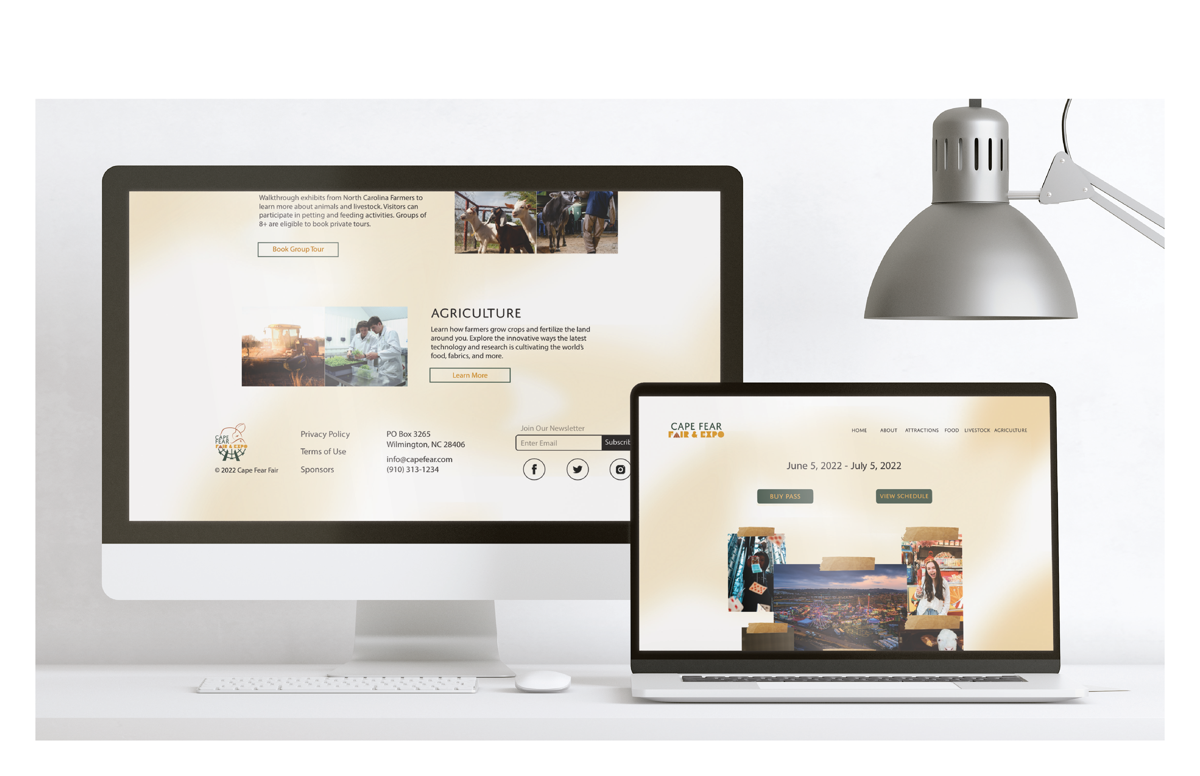
This project was expanded into a landing page for the festival. The page has two call-to-actions: buy tickets and get more information. The layout of the website was created using Adobe XD utilizing the 12 column system for website design. The background of the web page is a soft gradient to modernize the festival and the buttons are green for contrast. A sample video was created to promote the event and showcase the offerings of the festival. This video was created in Premiere Rush using stock video and royalty-free music.