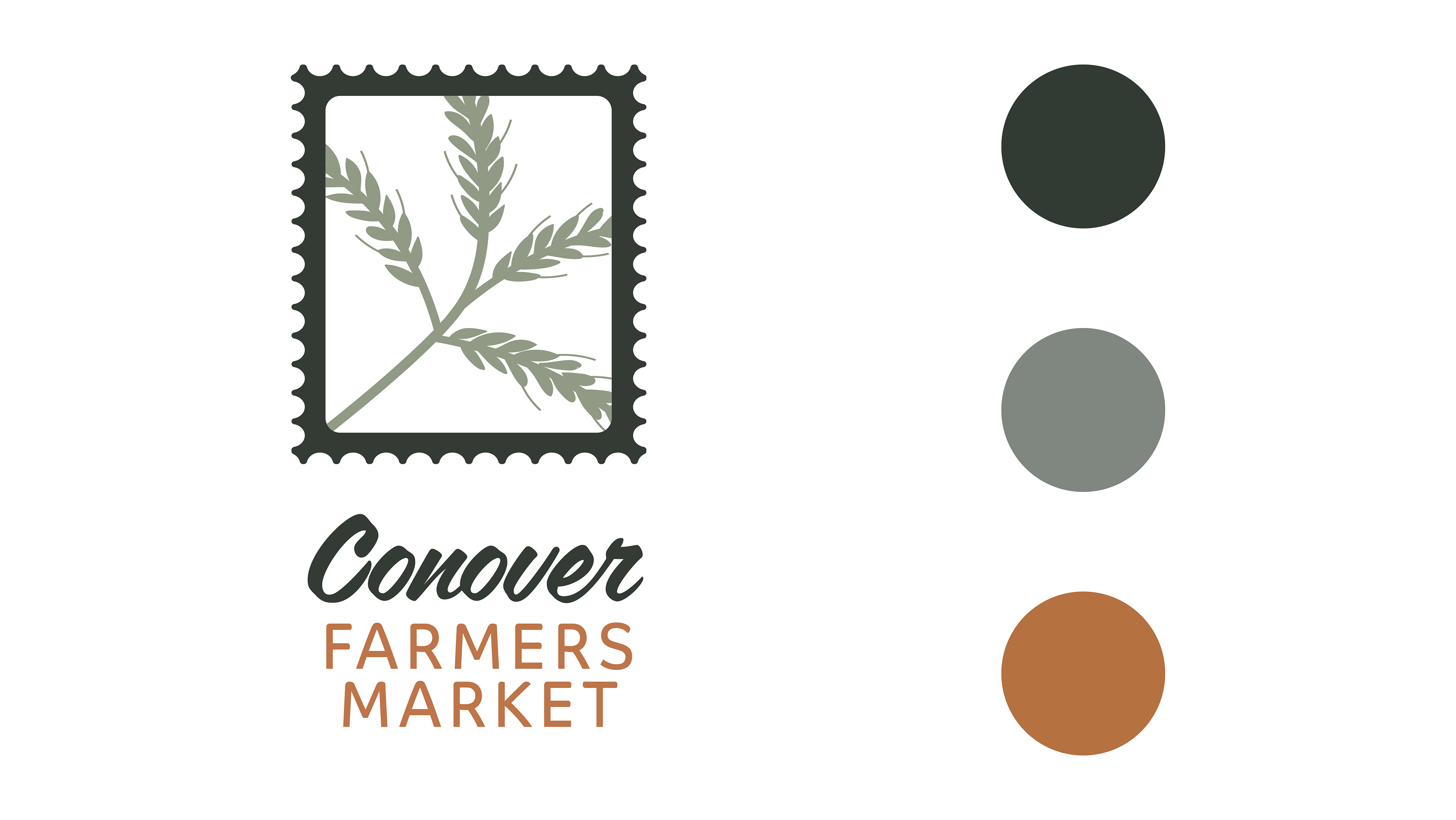
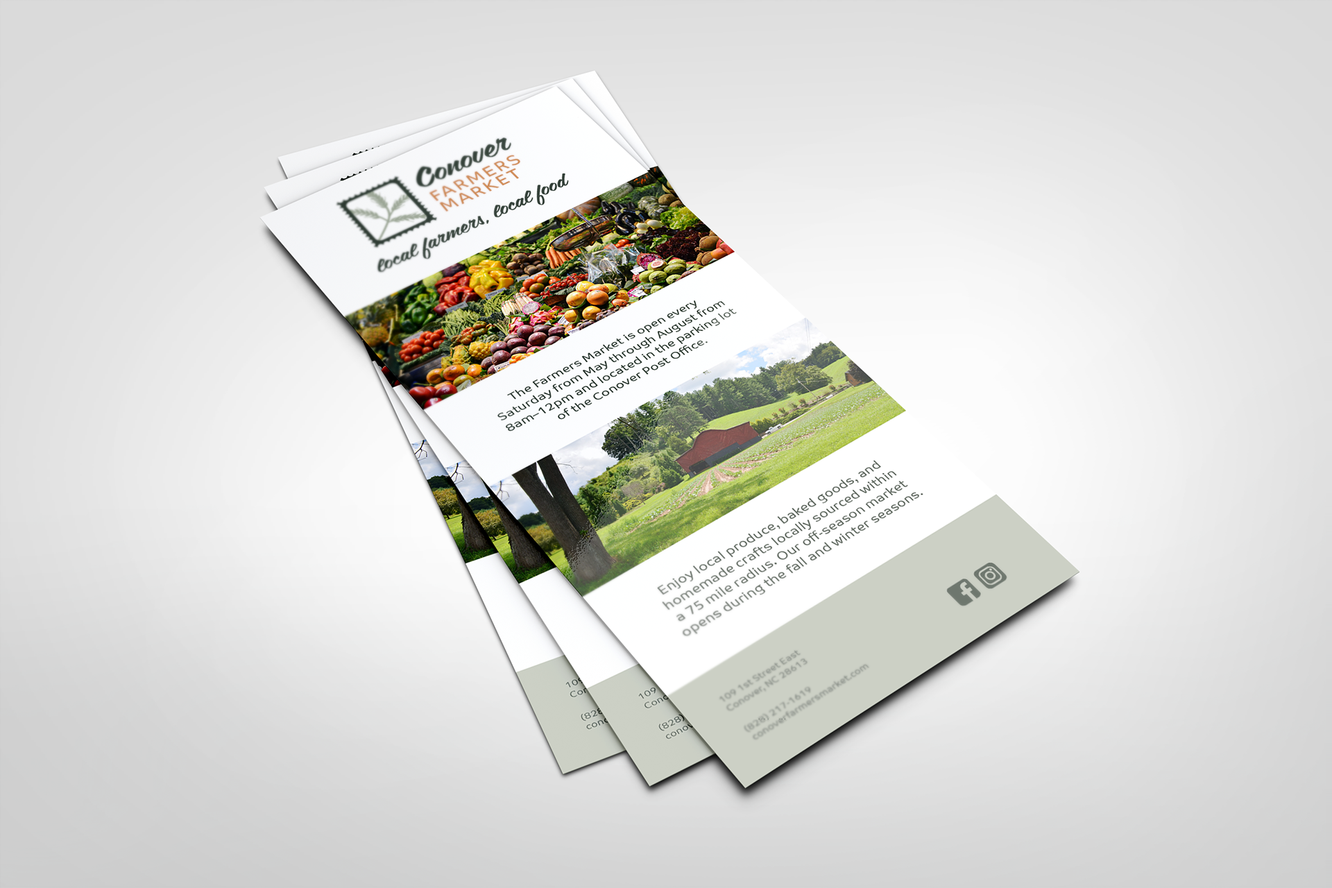
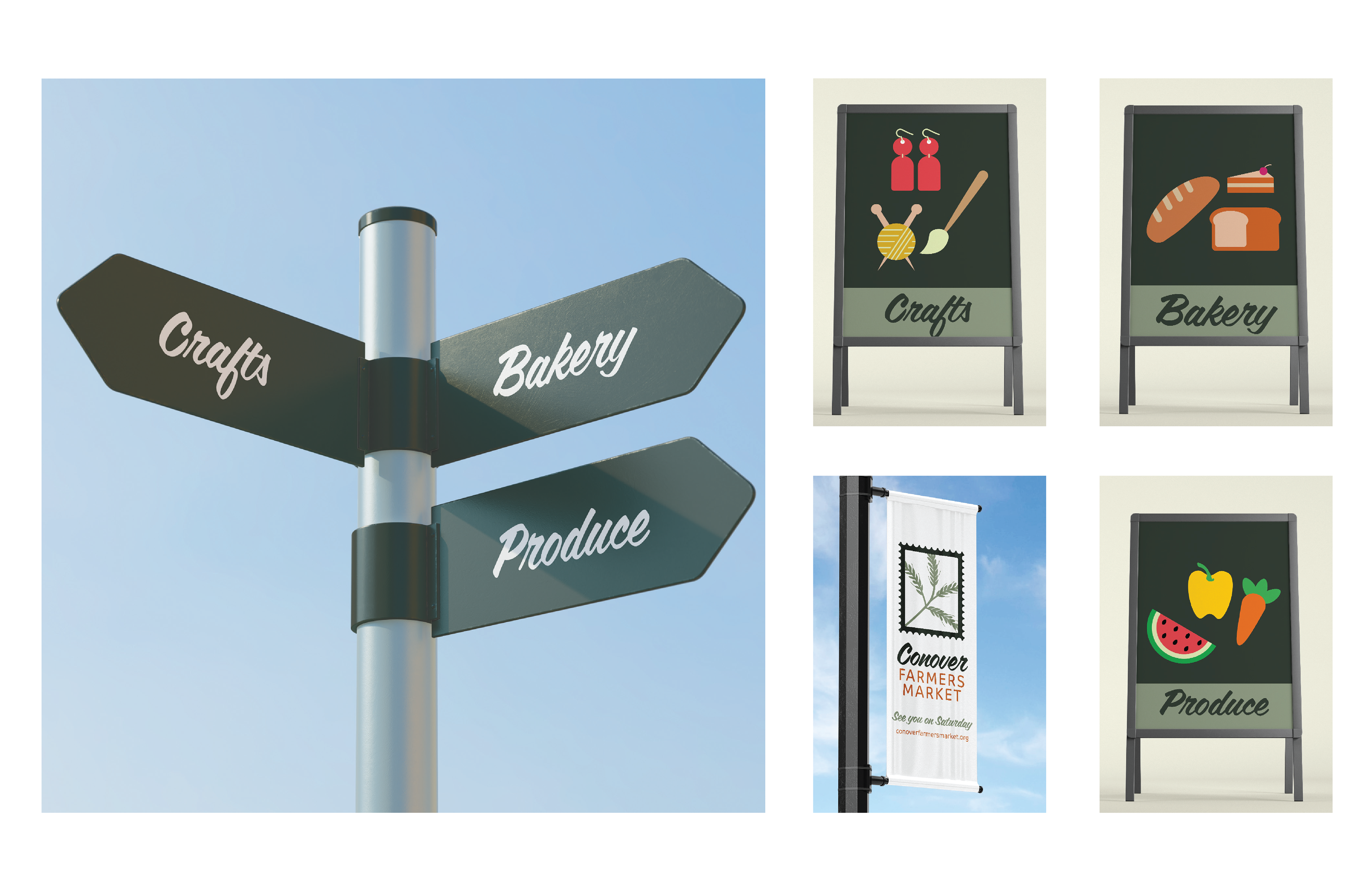
Conover Farmers Market has asked for a full rebrand for the market. The inspiration behind the logo incorporates the five-point intersection where the farmers market is held in Conover, NC- in the parking lot of the Post Office. A buckwheat is outlined in a graphically reduced approach to the five-point intersection. The postage design acknowledges the Conover Post Office as an homage to where the Market is held on Saturdays. The colors are reminiscent of colors found in nature. The identity packaging includes a business card, letterhead, and an envelope. To help visitors navigate the area, wayfinding signage was created and additional items were designed to assist the Market expand. The tagline "local farmers, local food" is a nod to the 75-mile radius the farmers and vendors travel from. A rack card was designed to share more information about the Market and aid marketing efforts.